The logo’s colours filmed in real time from our vineyards
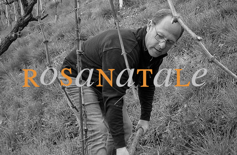
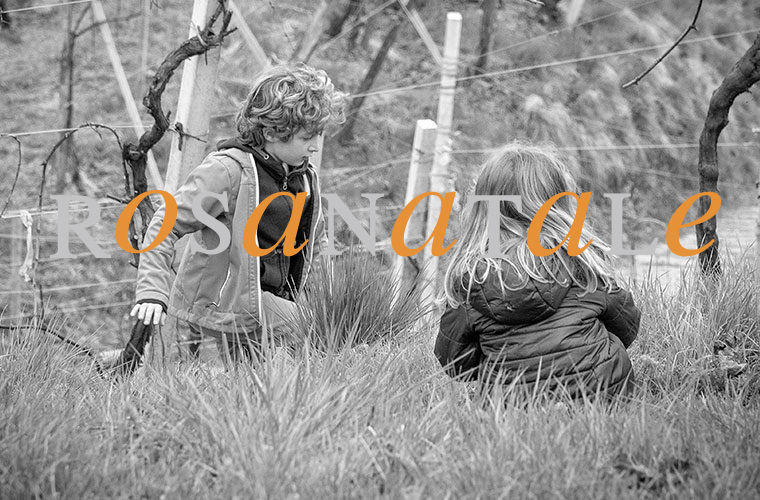
We want to take you to our vineyards; to live with us the change of seasons, the beauty and variety of colours as well as the difficulties related to climate change.
The logo you see is updated in real time according to the colours of the vineyard: lights, shadows, the bright spring greens, or the warm autumn reds, the white of the fog banks, the darkness of the night.
RThe origin of the brand
A brand
that speaks about us
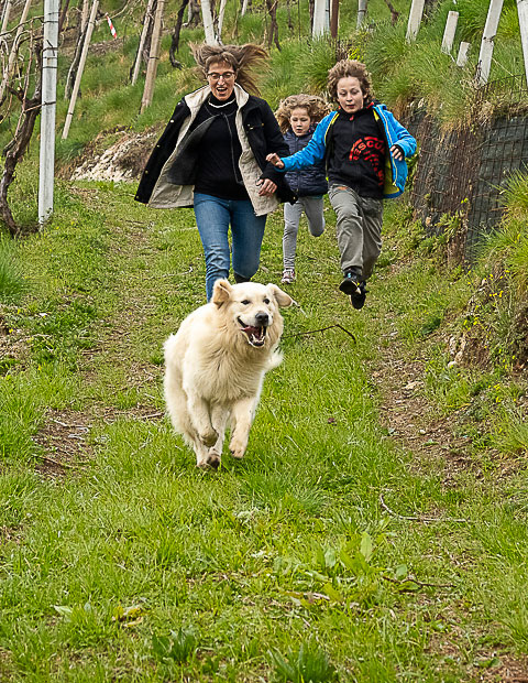
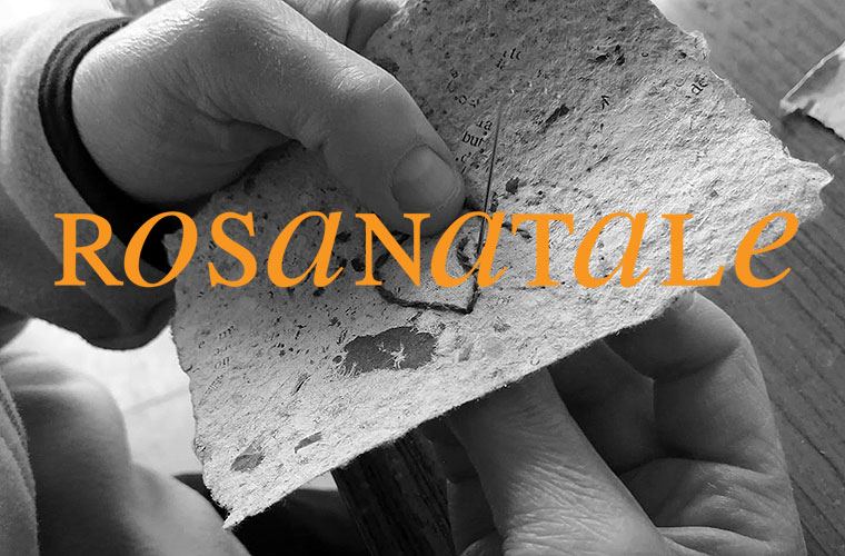
We have created a trademark which recounts our being a family and part of a community; the shared work of grownups and children and the collaboration with some local realities such as cooperatives which operate in the world of disability.
The name Rosanatale is the combination of our parents’ names: Rosa and Natale; only the names with which we called ourselves in family and among friends.


RThe logotype
Uppercase
consonants

The great, the adult: the roots and the protection
RThe logotype
Lowercase
vowels

The little, the child: the lifeblood and the future


R The logotype
Alternation
of block letters/italics

The diversity: in diversity there is harmony and strength
